The test line is the Blue, presumably because it has the lowest ridership, and is good as a test.
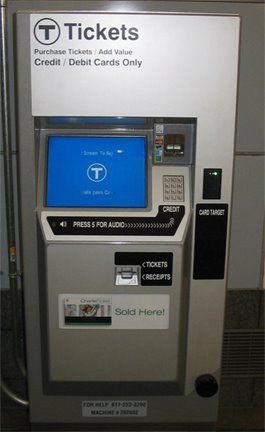
Of course, the T can't do something without messing some part of it up (read: Silver Line), and what they messed up in this case is the design of the machines. When was this thing made, 1983? It looks like an ATM prototype. Check out the metal number buttons. Who uses mechanical buttons? Why make something with moving parts? Hey, MBTA, have you seen an ATM lately? How about a TOUCH SCREEN. Even with the physical design errors, they could've done a better job on the machine aesthetics. I especially like the "press 5 for audio" coupled with a dotted line to the number pad, and bland 'wintel' box color scheme.
Idiots.
2 comments:
I know what you mean. If you go to the NY the metrocard machines look great! The screens are touch screens by the way. The mechanical number keys are there for blind people who can't see touch screens but can feel real buttons.
OK, so I forgot about the blind access thing and number pads.
However, and this is in no way an affront to blind people, or people who know blind people, etc.
But how do the blind even know the machine is there, and on it, where the number pad is?
Then there's the running joke about DRIVE THROUGH ATM's having a braille number pad.
Post a Comment